We are happy to announce the addition to our library of Thom Niessink’s Chromoxome Pro.
Designed by Dutch designer Thom Niessink, Chromoxome Pro is the completely redesigned version of the all caps modular typeface Chromoxome.
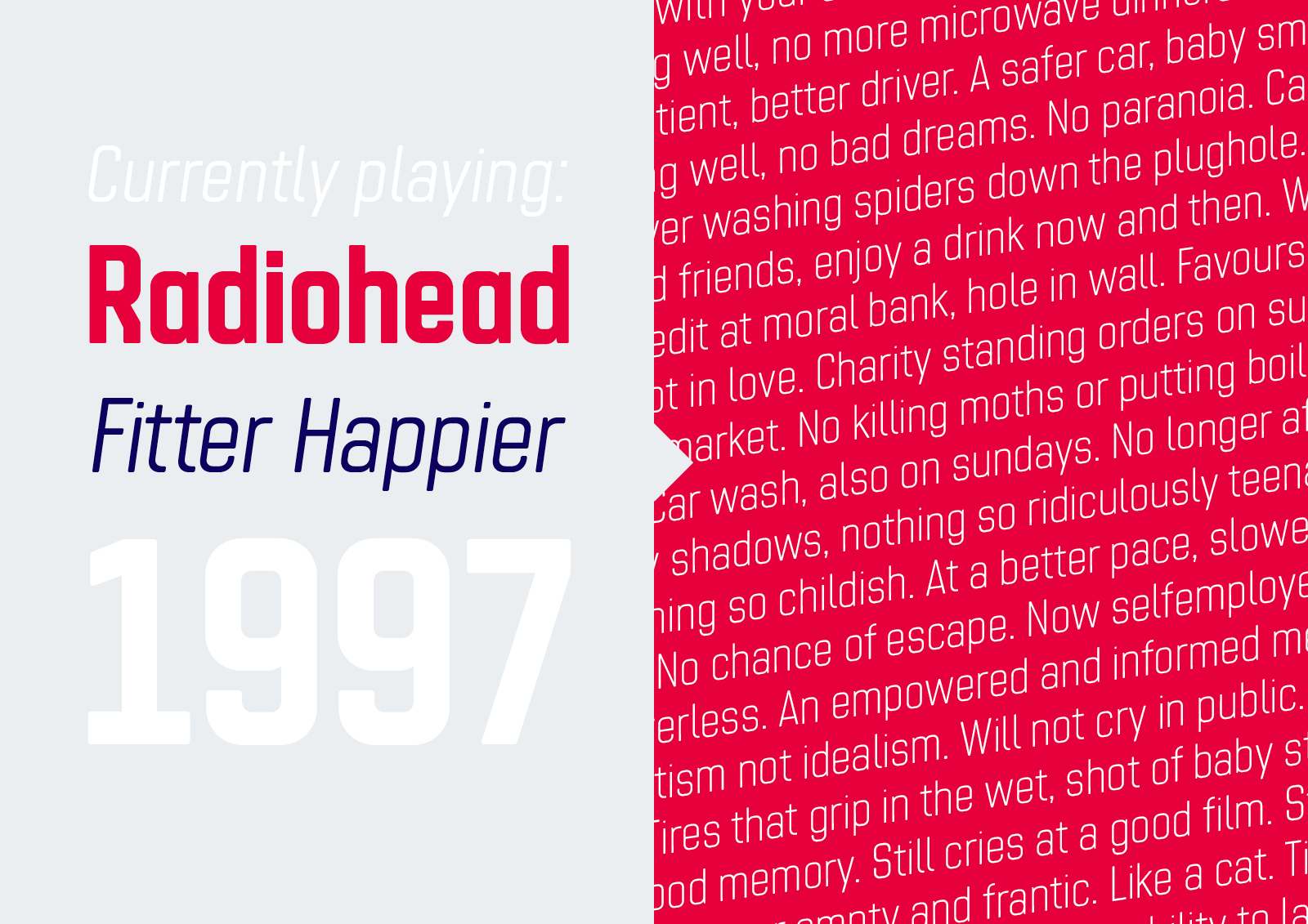
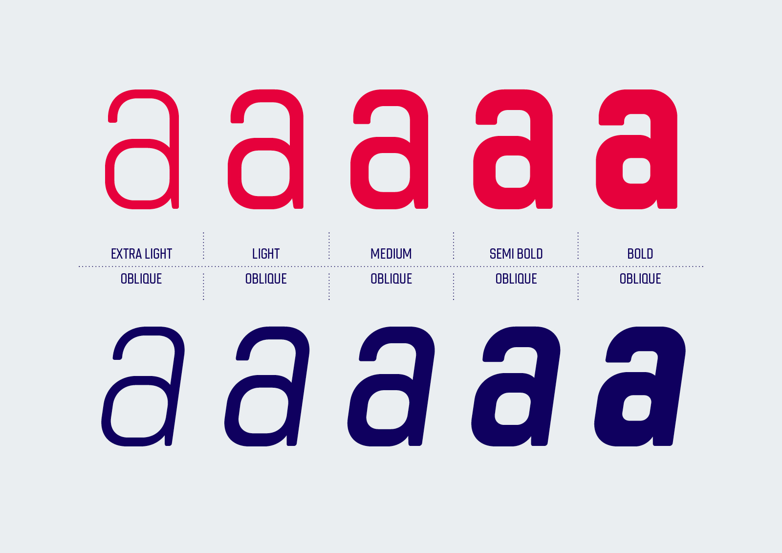
Chromoxome Pro is a square-ish geometric font family consisting of 5 different weights and 2 different styles (upright and an 8° oblique). Thom put his Dutch influences to good use in order to instil the typeface with a distinct modernist personality and a modular gridnik feel, softened by subtle rounded corners.
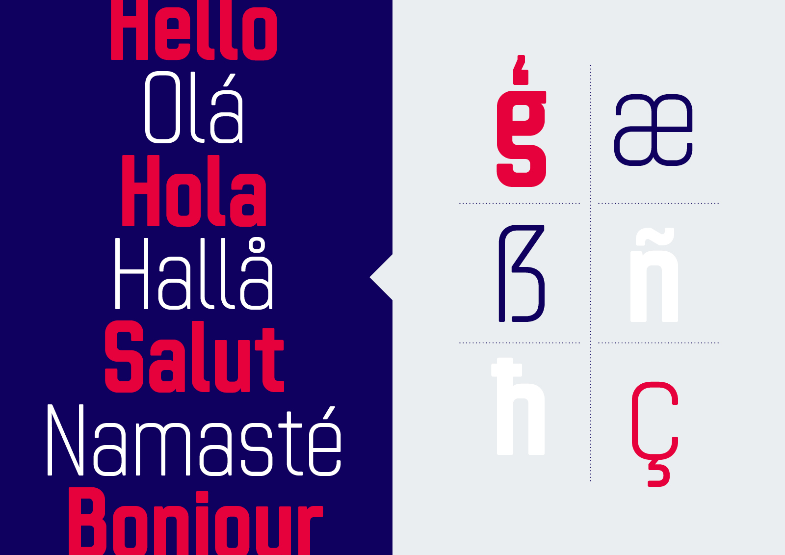
As well as the the redrawn characters from the original version, it also contains lowercase characters, multiple OpenType features and extended Latin support. The more expressive glyphs are set as stylistic alternates, making the overall typeface suitable for a wide range of situations, rather than just display usage.
Chromoxome Pro comes with a reduced base pricing for the individual styles, making it a very affordable option. Chromoxome Pro is available under our exclusive desktop, webfont, app and broadcast font license.