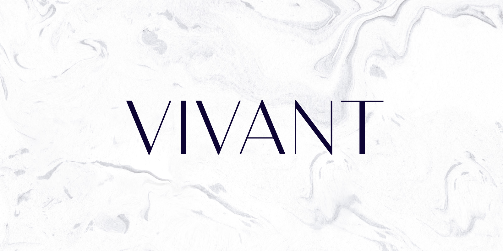
There’s a new typeface in town boasting a delicate contrast parred with a considered economy of shapes. Bw Vivant: Catwalk material.
Alberto Romanos and Moritz Kleinsorge are the designers behind this stylish type family of 7 weights. The lightest weight is named “Skinny” and it feels very fragile and about to snap bringing a sense of unhealthy decadence. While the thicker the weights get, the more some 20s art-deco hints start to creep in.
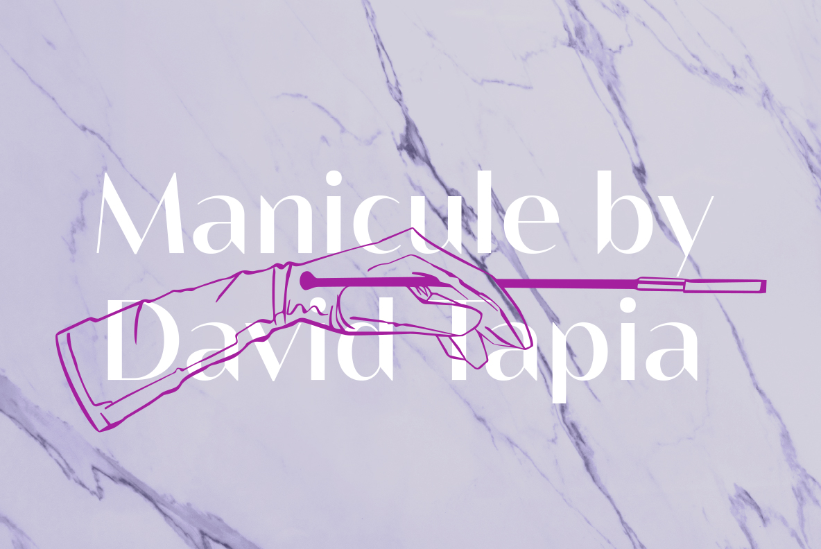
The references to the fashion world don’t end there. Bw Vivant includes a manicule that it’s actually an illustration inspired by the iconic Audrey Hepburn’s gloves in Breakfast at Tiffany’s, by Spanish artist David Tapia.
We virtually sat down with Alberto and Moritz to find out more about their latest germanic-hispanic collaboration.
Where is the inspiration for Bw Vivant coming from? How did the idea originate?
Moritz: After releasing Bw James I started with two projects, Klainy and Bw Vivant. I shared my ideas with Alberto and he also wanted to have a high contrast sans serif in his portfolio, so we decided to collaborate again.
Alberto: High contrast is normally associated with serif fonts. I wanted to capture the elegance of a didone reduced to its barebones. I had toyed with the idea of a contrasted sans serif for a while, I even have a modulated sketch of Bw Modelica somewhere but when I saw Moritz’s take on the idea I thought his was a much better starting point.
Has the released typeface changed a lot from your initial vision for the font? How was the creative and development process?
M: Totally, in the beginning my design was very calm and unobtrusive, Alberto pushed the typeface a lot to get a new characteristic. The final font is much more modern and recognisable. SS01 with the pointed spurs is even futuristic in some way, although a typeface with contrast is often very classical.
A: It’s my fault! In fact, the initial drawings were closer to a serif-less didone, with the curves joining the stems very smoothly. We kept pushing and trying different things through endless iterations.
Moritz, this is your second collaboration with Branding with Type after Bw James. Where there any differences on the process of designing both typefaces?
M: With Bw Vivant, Alberto was involved in the process right from the beginning. James started as my bachelor thesis, later Pilar Cano gave me a lot of feedback. This time, Alberto was the one who gave me feedback and together we developed the concept.
A: When Moritz approached me with Bw James, the typeface was almost ready for publishing. With Bw Vivant we both were there since the early days.
Where would you like to see Bw Vivant in use?
M: In movie posters, it can be the new Trajan! But of course, a high contrast typeface is typical for the fashion and cosmetics industry.
A: I agree Bw Vivant feels at home anywhere fashion or luxury related. I will be very surprised if I see it on a plumber’s van, even if it’s a very posh one.

About Bw Vivant
Designed by Moritz Kleinsorge & Alberto Romanos, Bw Vivant is a glamorous sans serif font family. It marries the visual appeal of deeply modulated serif typefaces with a minimal geometric approach, discarding any accessory element on the hunt for the cleanest shapes.
The result is a high contrast sans serif exuding elegance and glamour across every touchpoint, with subtle art-deco and classic cues coming through while feeling contemporary.
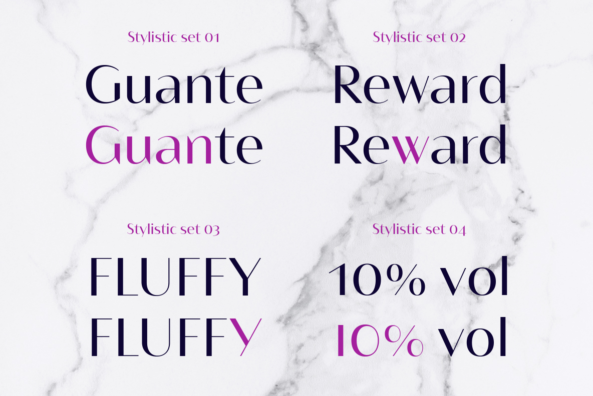
Available in 7 weights with the “thins” staying constant throughout, Bw Vivant supports all European Latin languages and it includes OpenType features like many discretionary ligatures, stylistic sets, old style figures or case sensitive forms among others.
Bw Vivant licenses are 50% off until the 8th of June
All our font families can be licensed under any our our standard Desktop, webfont, desktop + webfont and the exclusive Branding with Type all-in-one licenses. A free demo version is also available for testing purposes.