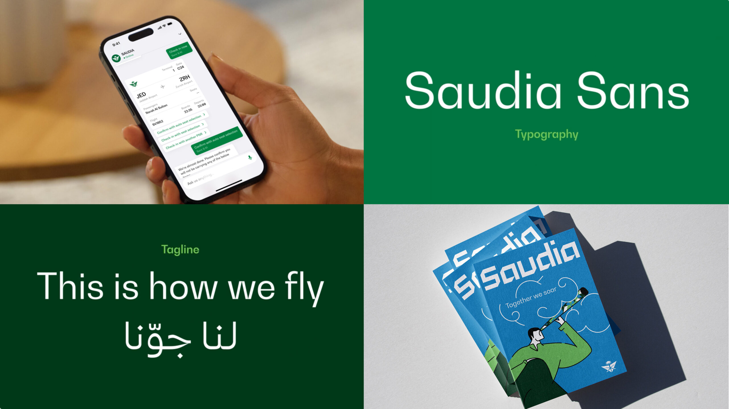
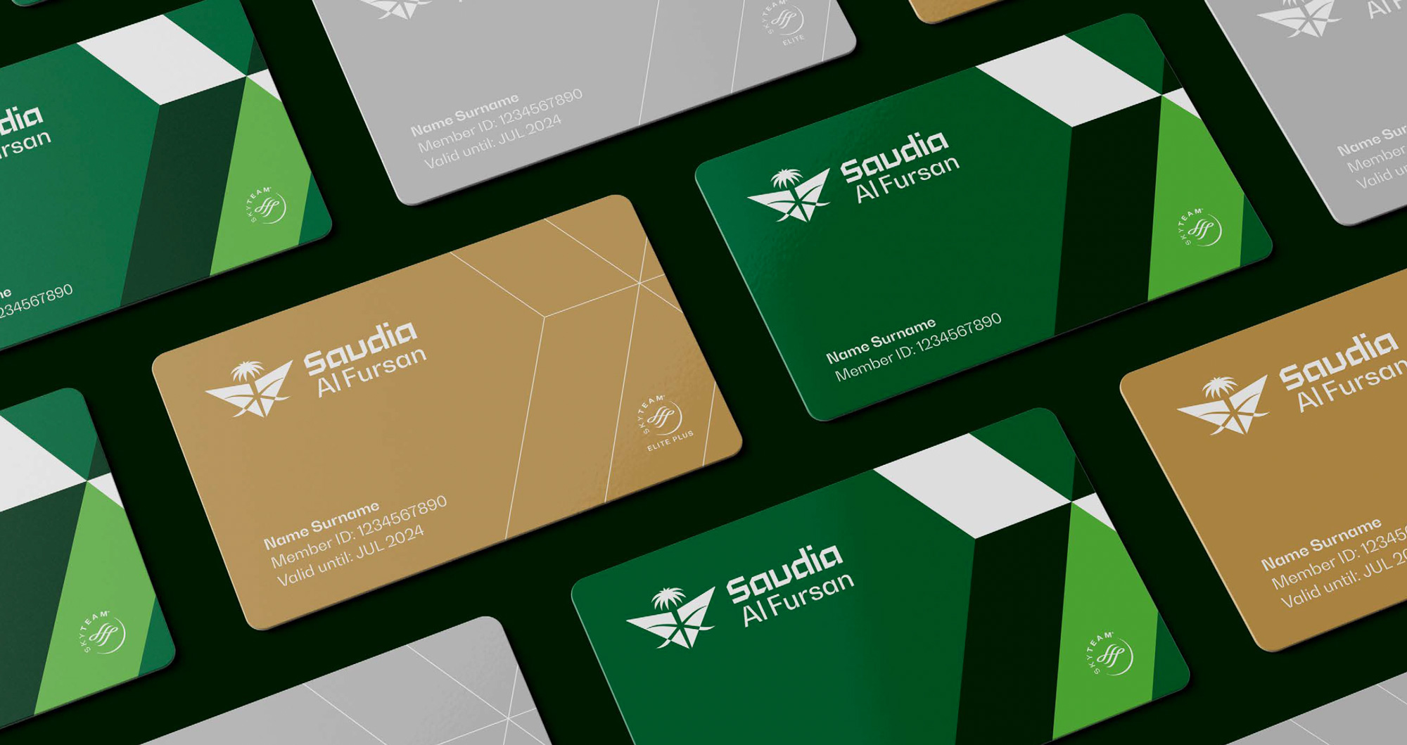
In 2023, we were approached by Landor to work on the typeface for the rebrand of Saudia Airlines.
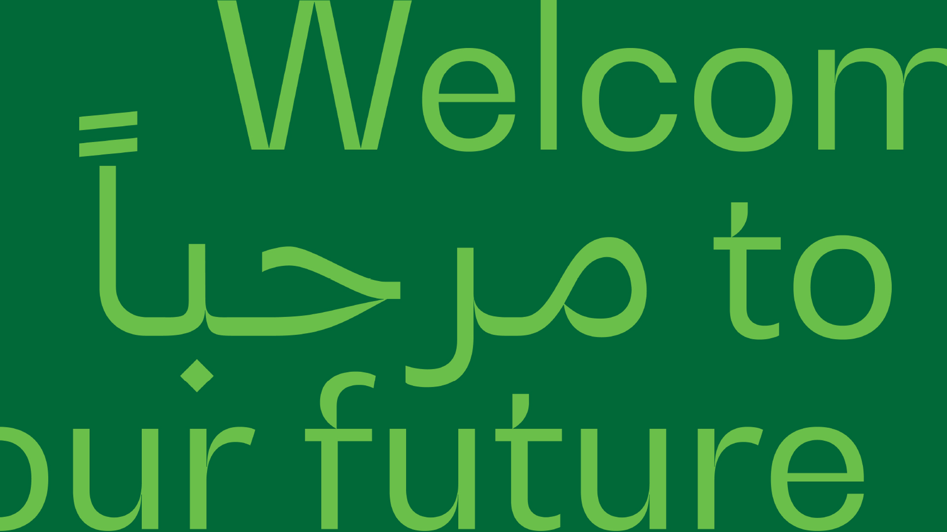
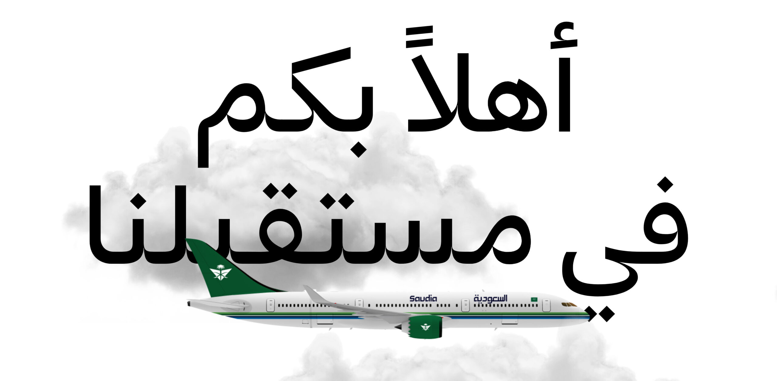
The design team at Landor had already identified Bw Gradual as the right typeface for the new brand, but it needed an Arabic counterpart. The main challenge was to find the right balance between legibility and visual continuity between the two writing systems without alienating the native readers. It’s quite easy to fall into a “latinised Arabic”, disregarding the fact the Arabic script is much more calligraphic and organic than the Latin. You have to be very wary of the cultural and practical nuances of each alphabet.
From the onset we brought on board the expertise of the very talented Tarek Atrissi, he was key throughout the entire process, from the early sketches to the final stages of the design.
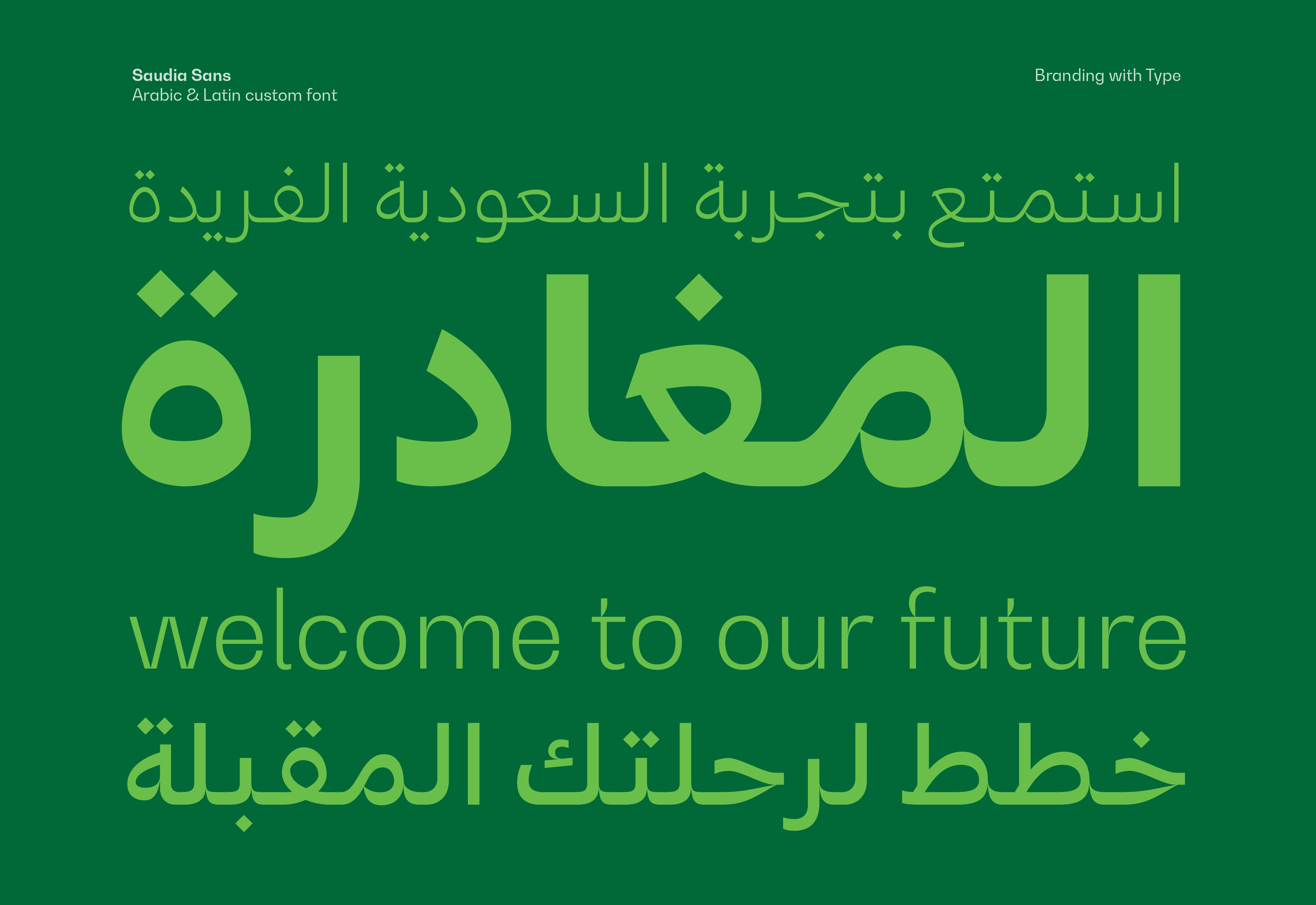
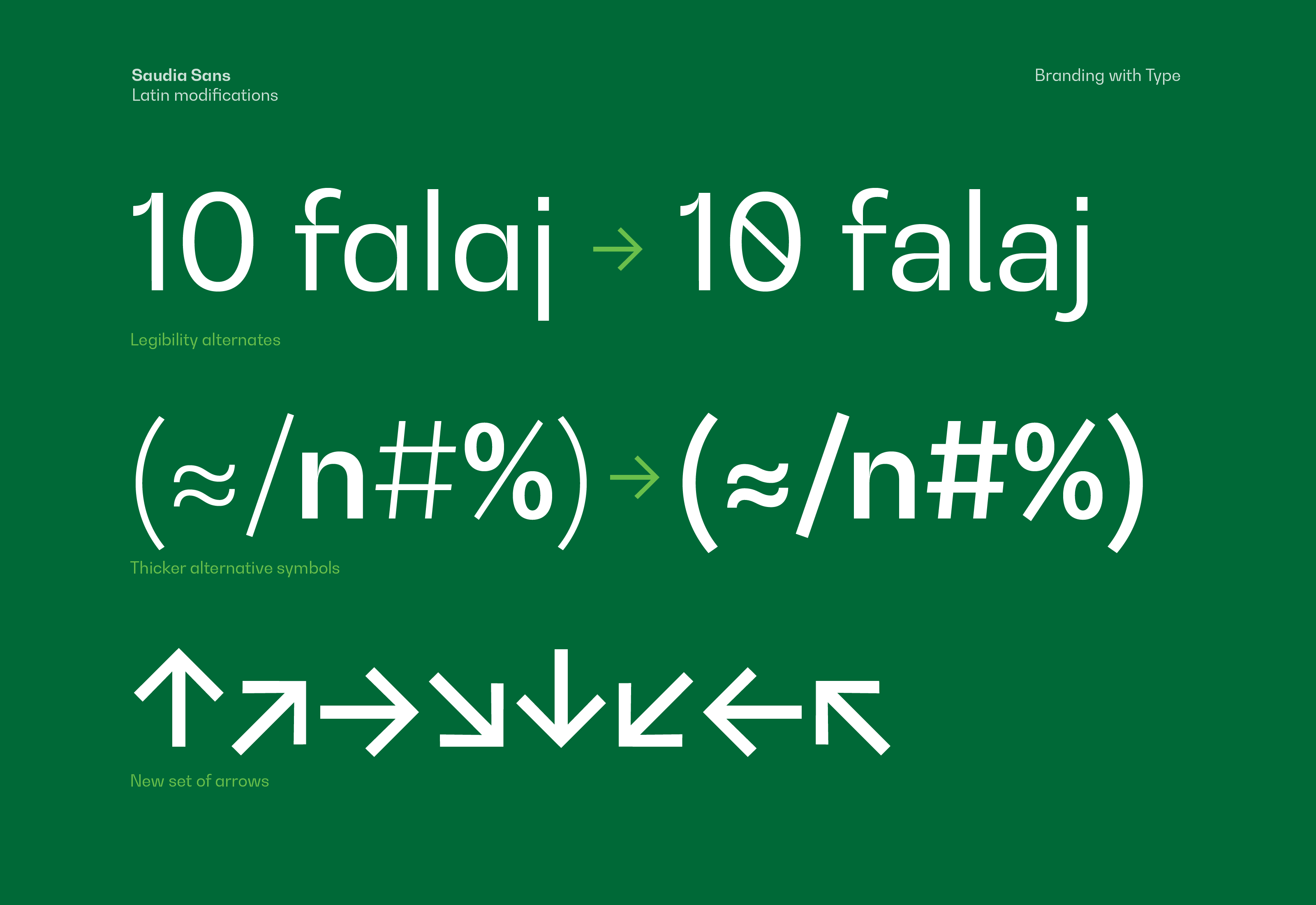
Although the core of the project was to create this custom Arabic version of Bw Gradual, we also modified a handful of Latin characters in order to improve legibility, creating a truly ownable asset for the airline.
In the end, we managed to capture the essence of the original design and translate it properly into the Arabic script. The result is a multilingual typeface covering the Latin and Arabic scripts that allows Saudia to express their tone of voice and personality seamlessly across multiple languages.