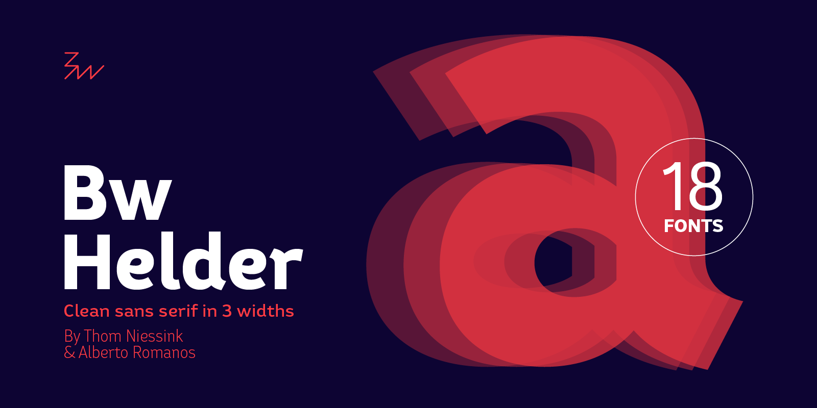
Designed by Thom Niessink & Alberto Romanos, Bw Helder is the first font on our library born out of the direct collaboration of two designers. This type family is inspired by an old piece of lettering Thom came across at his grandma’s garden: The ornamental serifs featured on the original lettering have been tamed down attending to a functional criteria, conferring this type family its unique organic character without compromising its legibility.

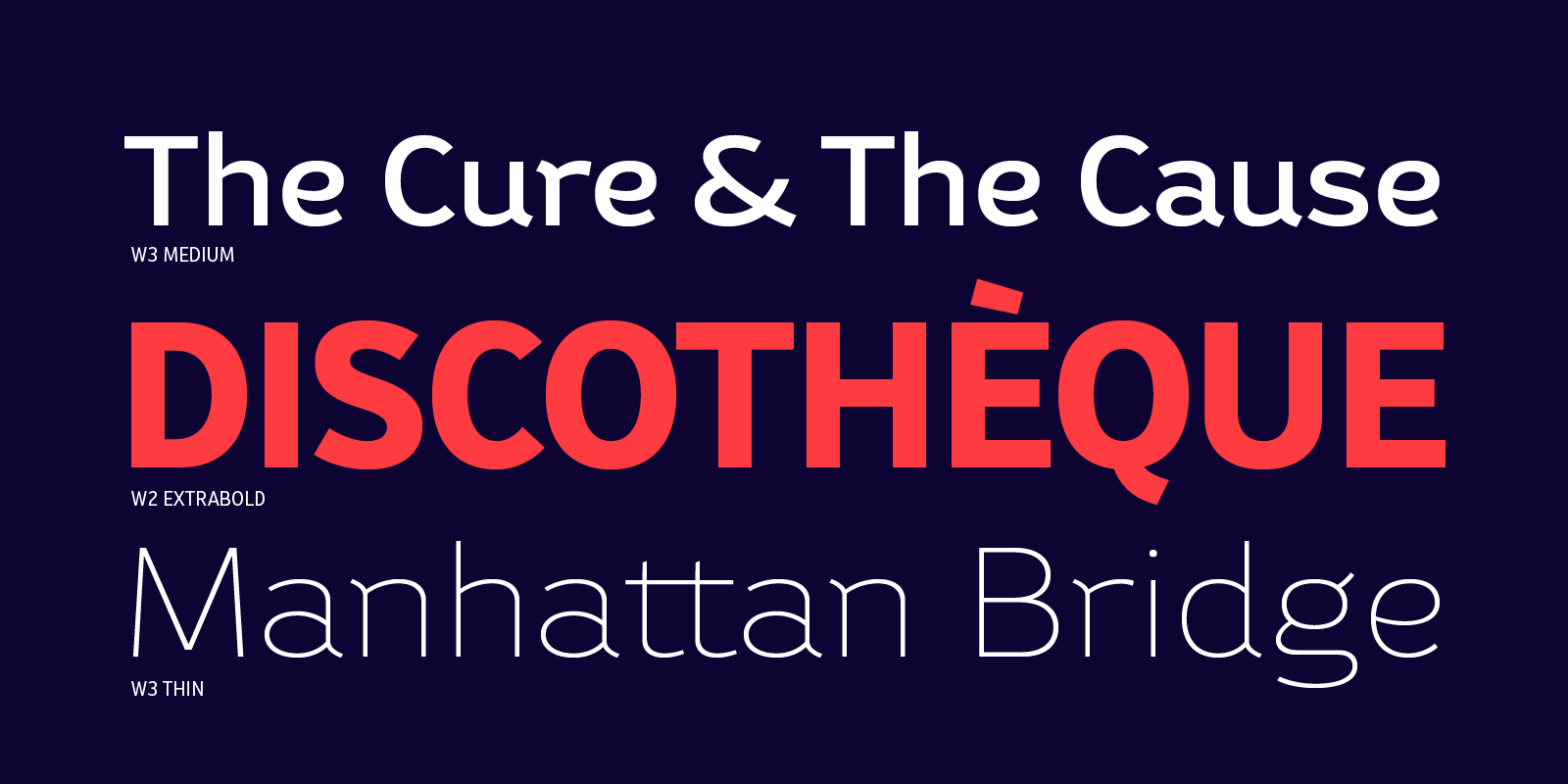
The initial prototypes were rather condensed, clearly influenced by the original source of inspiration. It didn’t take us long to conclude we would need to add wider versions for Bw Helder to be really useful for graphic designers.
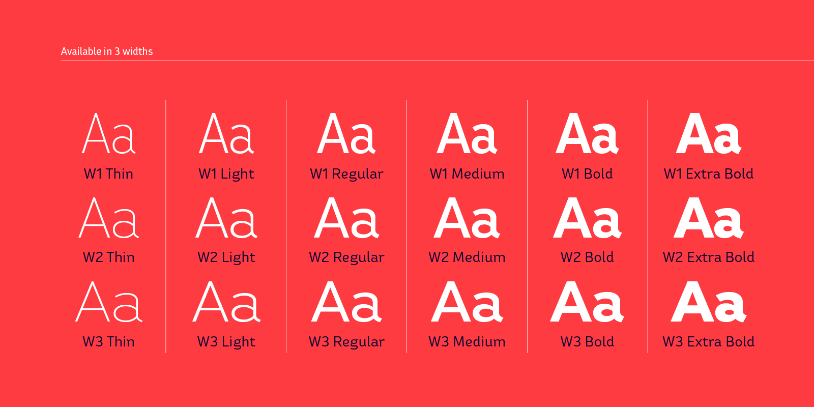
We aimed at a consistent texture across the three widths and we achieved that by “beefing up” the darker weights at the same time they were getting wider. For example, if we look at the ExtraBold weight across the three widths, the stems on W3 are actually wider than on W1 (170 v. 150 units), although optically they look the same weight, creating a similar colour.

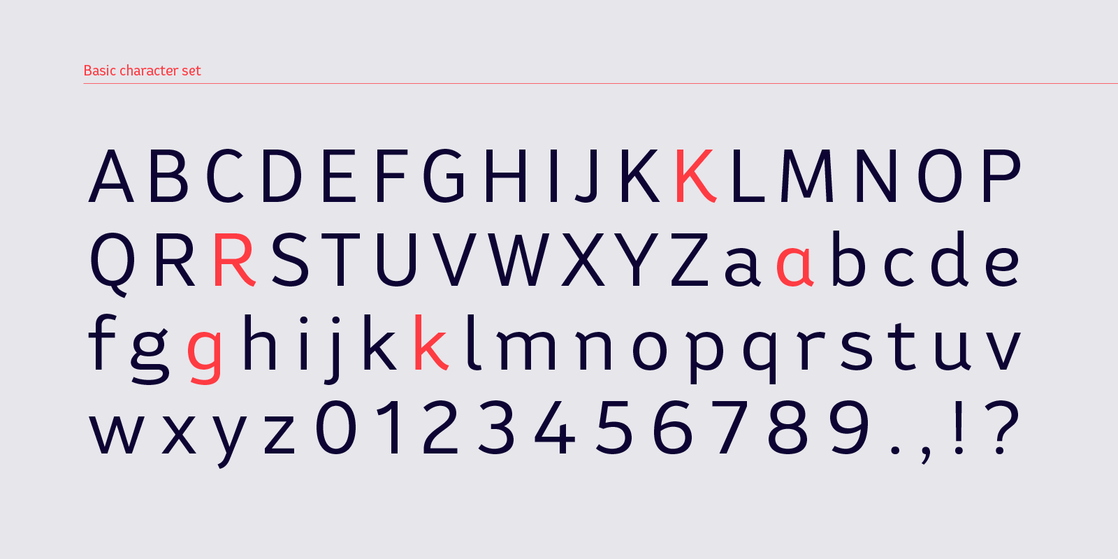
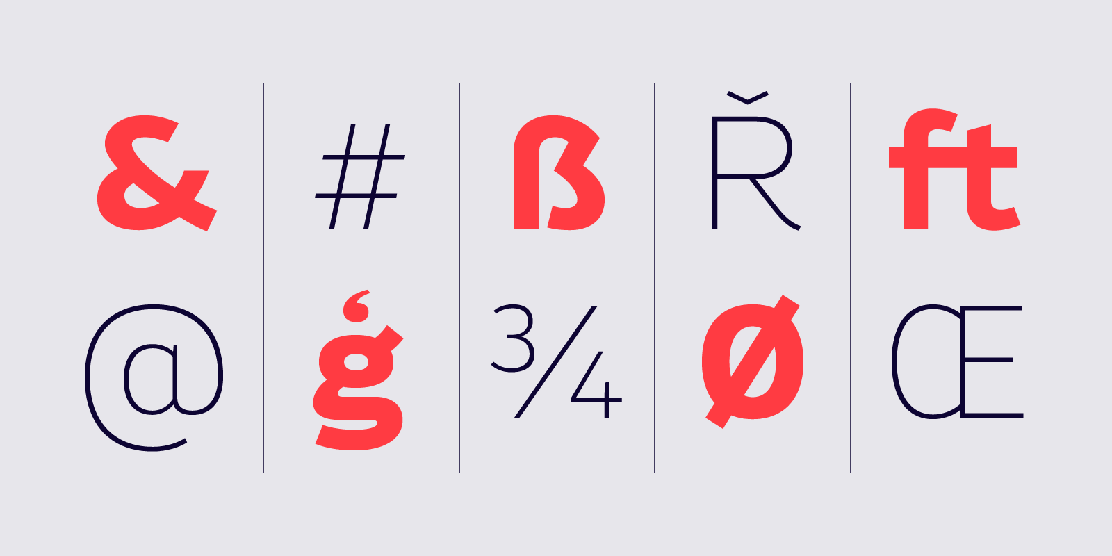
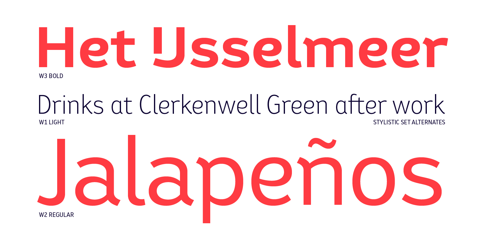
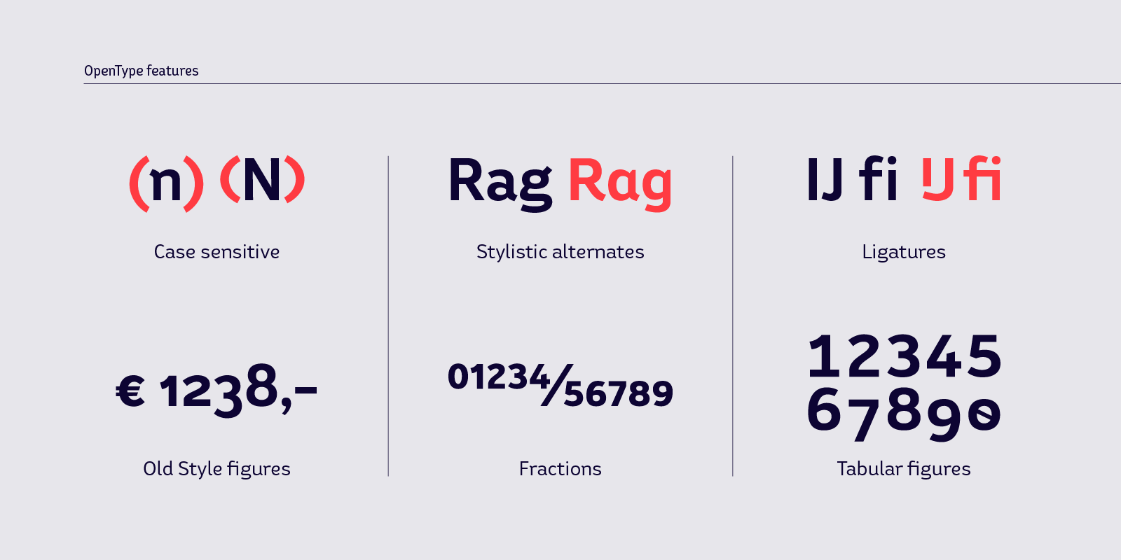
Bw Helder is a clean and versatile sans serif combining gentle subtleties on its curves with remarkable spurs branching off its stems. It instills a friendly yet professional tone of voice, while maintaining the composure when used in longer paragraphs at small sizes. Three different widths across six weights provide plenty of options and flexibility for the task at hand.