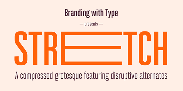
On October the 9th 2015 we launched our second retail font: Bw Stretch, a compressed grotesque with some disruptive alternates, designed mainly for headlines and display purposes but also confortable in longer paragraphs and body copy sizes.
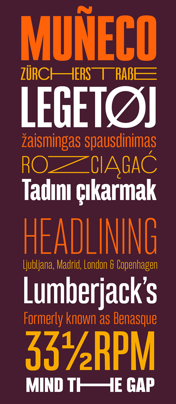
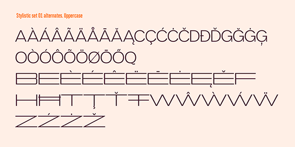
The new font release desinged by Alberto Romanos, spreads across 8 weights from Thin to Heavy, covering all European Latin languages. It includes extended features like small/petite caps, fractions, case sensitive forms, discretionary ligatures and disruptive titling alternates.
The idea behind this typeface started back in 2013, working on a new identity pitch with a branding consultancy. At that time, only the logotype was able to stretch each of its letterforms, representing how much the company would adapt and go the extra mile to meet its customers needs. Sadly, the proposed identity was rejected by the client, but the thought of having a font with some characters able to expand dramatically, kept resonating until earlier in 2015 when the development of Bw Stretch started.
The initial 2013 drawings were based around a pure geometric sans with only a handful of characters. The shift towards a condensed skeleton in order to increase the contrast between the ‘normal’ characters and the alternates was the first important design decision.
The early iterations of Bw Stretch were a bit too mechanical and rigid; it wasn’t until the first week of September when attending TypeClinic in Slovenia, where the decision of moving towards a more classic narrow grotesque feel was made, removing all the extra odd quirks.

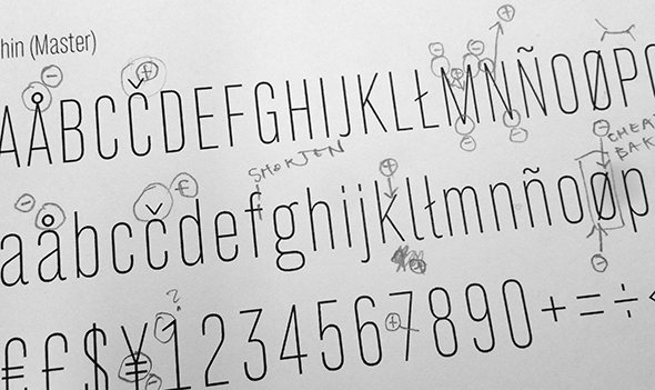
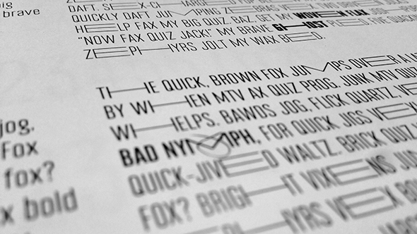
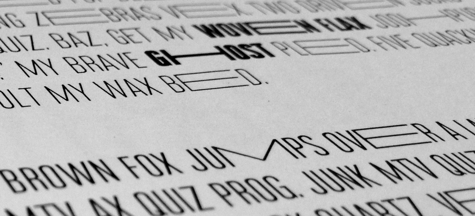
After many tests expanding all the available glyphs, only certain capital characters made the cut, playing a lovely balance between disruption and legibility.
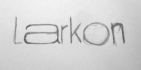
Initially named Benasque after a small village in the Pyrenees, Stretch resulted as a much better fit.