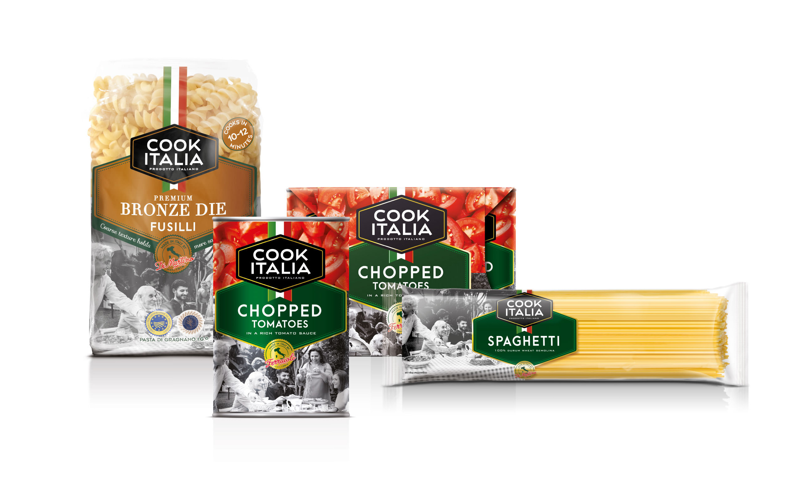
Cook Italia is the new name of Cook Italian, a UK based brand known for their high-quality, Italian sourced ingredients. With the new name comes a brand refresh across their packaging range and beyond, developed by Brandon Consultants. Brandon design team approached Branding with Type to help refine further their wordmark to better reflect their Italian quality.
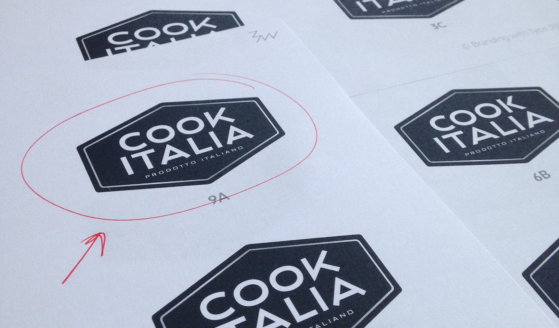
We began by alining vertically the first ‘O’ and ‘A’ and re-built the wordmark from there. We explored different widths and proportions as well as different treatments for the key characters, always with the Italian sans serif typography of their Futurism and art-deco periods in mind.
After a fist round of feedback, we narrowed down the options and focused even more on the details, harmonising the rhythm of the wordmark and refining the terminals on the distinctive ‘K’ and the ‘A’s.
The new visual identity truly reflects their Italian heritage and ingredients, reinforcing the charm and authenticity of its offering.
Do you want to improve the typography of your brand? Branding with Type offers all-in-one branding fonts licenses, bespoke typeface design, font modification and logo refinement services. Get in touch for an estimate.